MOBILE
Welcome screens
|
Welcome screens |
wELLS fargo: Online wires

THE PROBLEM
In October 2020, our design team found out that a large percentage of online wires customers were dropping out of the onboarding flow before they got to the online wires home page. The onboarding experience included a single-page welcome screen with numbered steps, a terms and conditions flow, and multi-factor authentication. Limited data meant we couldn’t pinpoint where they were dropping off.
THE SOLUTION
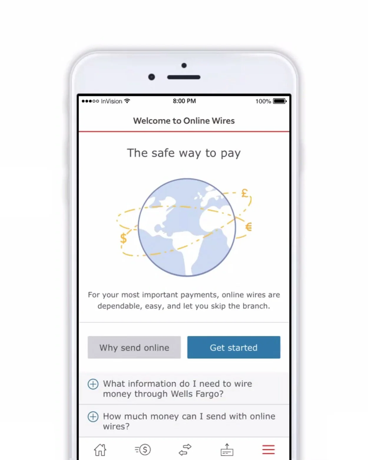
After analyzing what was in production and conducting a competitive analysis, I created a robust content strategy for new online wires customers. Anyone who had sent a wire in branch could start at their own pace, based on their main decision point: whether to send this wire at the branch or try the online platform.
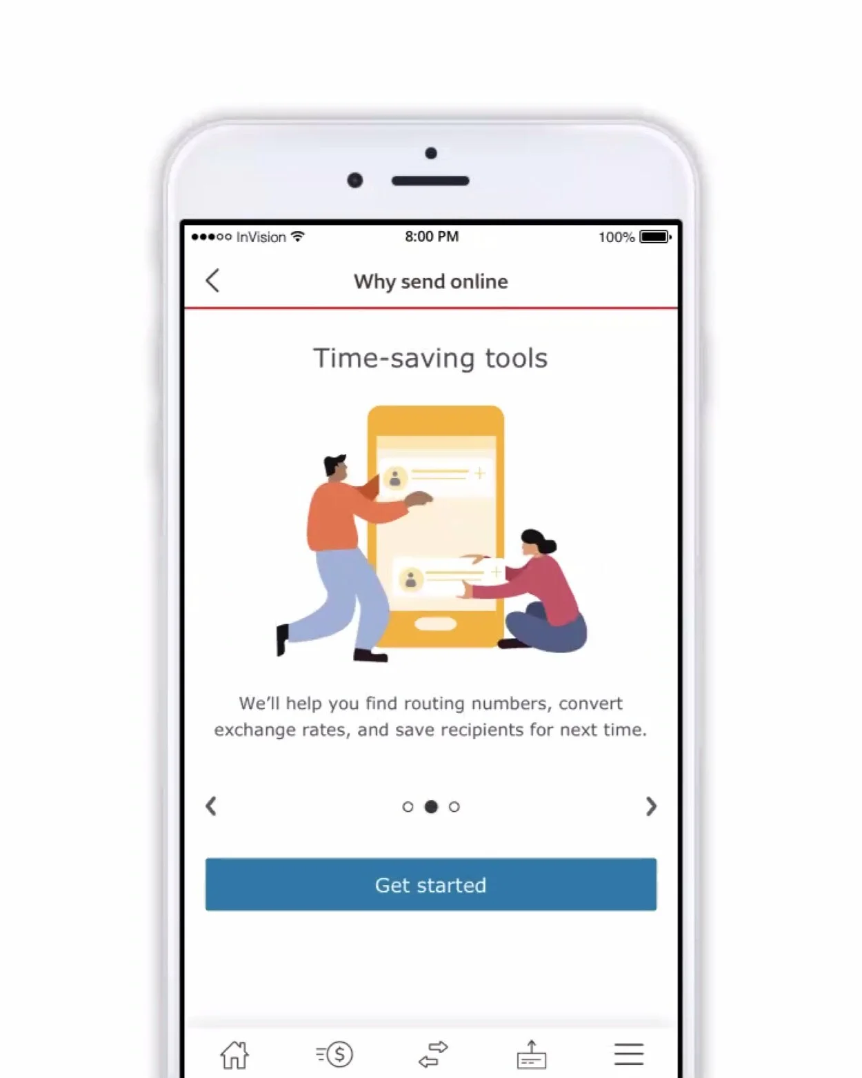
New customers who might need help understanding what online wires were, or why they might use them as a form of payment, could explore the Why send online carousel to learn why this might be the payment method for them.
wELLS fargo: Mobile Deposit
In January 2021, our design team revamped the Mobile Deposit welcome screen in order to update the most important value propositions as well as bring it in line with the new look and feel of branding across the payments platform.
THE PROBLEM
While the old screen was informative and fairly helpful, it positioned the idea of remote deposit as a unique novelty in the banking world, which wasn’t the mindset of most customers after 2020—and didn’t reflect why someone would use mobile deposit over stopping at an ATM.
Plus, the old welcome page didn’t address customers’ key questions (like “when is my money available?”) upfront.
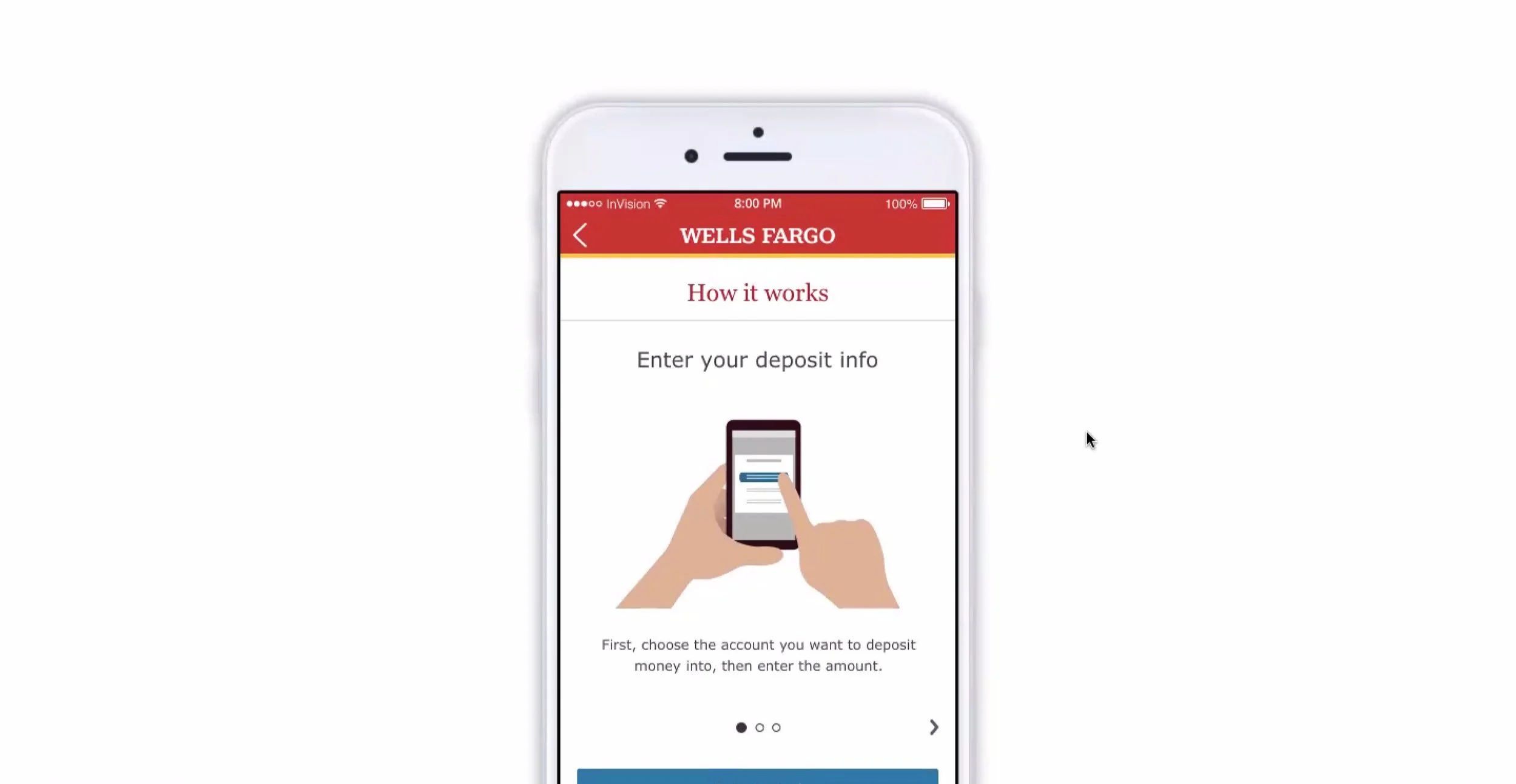
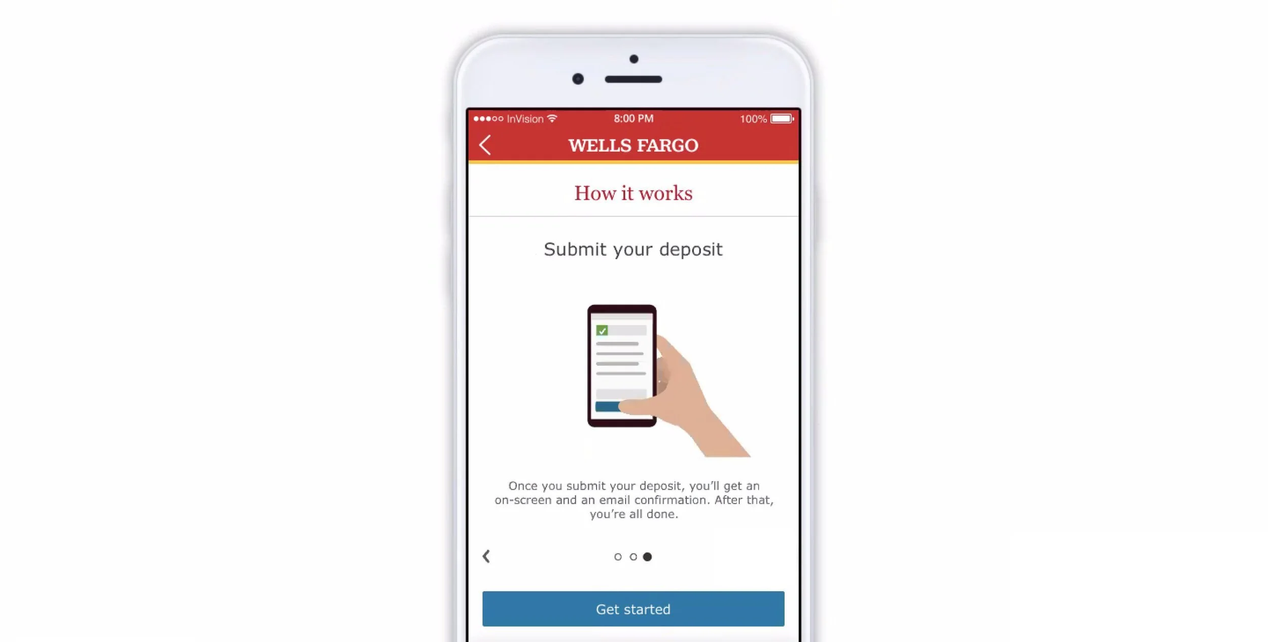
THE solution
Our new experience walked customers through the high-level steps of making a deposit, using the ‘How it works’ carousel. This way, new users who wanted to learn more about the product understood that mobile deposit was not a long or intimidating process. It also allowed everyone to scan key info on the main landing page before getting right to the experience, if they wanted to get started as quickly as possible.